Since the beginning of #InkTober I wanted to ink something.
I've never done inking (or rather digital inking) before and I suck at profiles, so once again I pushed my visual library to the limits.
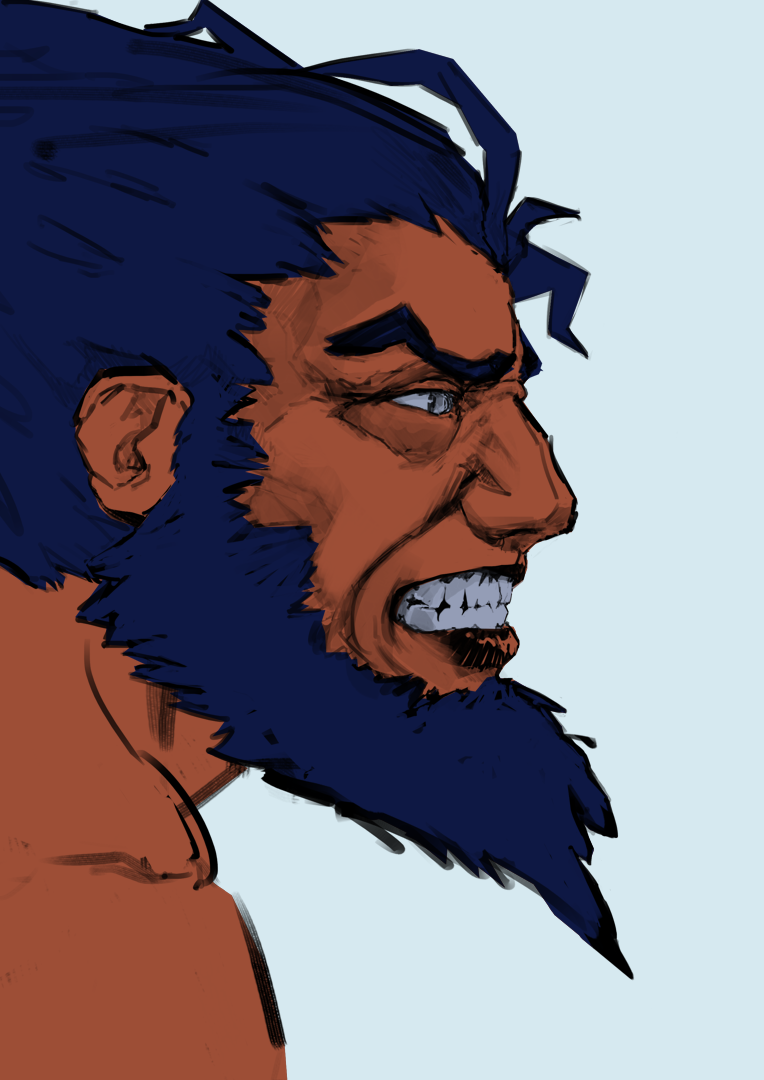
Here is the end result:


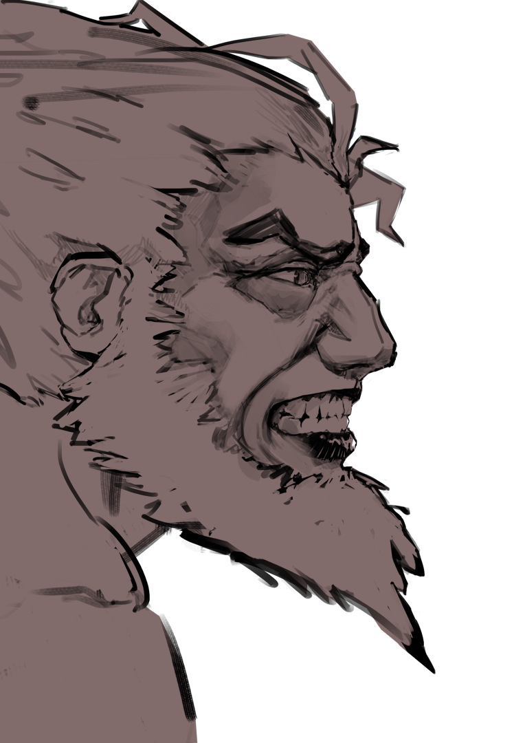
And here is the process:


It's rather short list of things to do:
-start with a strong shape;
-refine sketch to the point, where you can see where the light goes;
-put some flats;
-then go for the gradients;
-create some light and shadow cells;
-then do the inking;
-some colour balance and here you go.
I wanted to start with a strong shape to make him pop-out from the background immediately.
The viewer should, in a short glance, get what he's looking at.
Putting that dark triangular shape on light background helps with the read a lot.
Gradients are good way of bringing some visual interest and they're simple to do.
When it comes to lights and shadows I went for cell-shading 'cause:
a). it's much faster for me to cell-shade a face.
b). it goes along with inking pretty well.
I have to apologise you for not having any process pictures of inking.
That's because I got in "the zone" when I was doing that and I simply forgot about saving my process.
It's nothing super interesting 'tho. I mean it would be if I was recording that, but process pictures... I don't think so.
You may, as well, ask "Hey, but why you didn't start with the inking from the beginning?".
The answer is: that's the first time ever I inked something on that level of detail, so I allowed myself to cheat a little bit.
Tracing over the sketch is much harder, than tracing over coloured, almost finished illustration, when sketch gives you just extra level of noise.
You can forge that noise into something better really easily.
Tis' all,
So long